
Sabor (pronounced sah-BOHR) is a Spanish word meaning "flavour." Inspired by the rich colours, textures, and warmth of Mexican culture, Sabor Design System blends visual vibrancy with user-centred functionality. Created for a Mexican restaurant take-out app, it features a palette of rich cacao brown with fresh lime and cilantro greens to bring warmth and clarity to every interface.
The goal was to build a design system that felt flavourful and inviting, capturing the vibrancy of Mexican culture, while staying functional and easy to use. It needed to be consistent and expressive without overwhelming the user experience.
I started by conducting competitive research, analyzing popular food delivery apps to understand common patterns and identify opportunities to stand out.
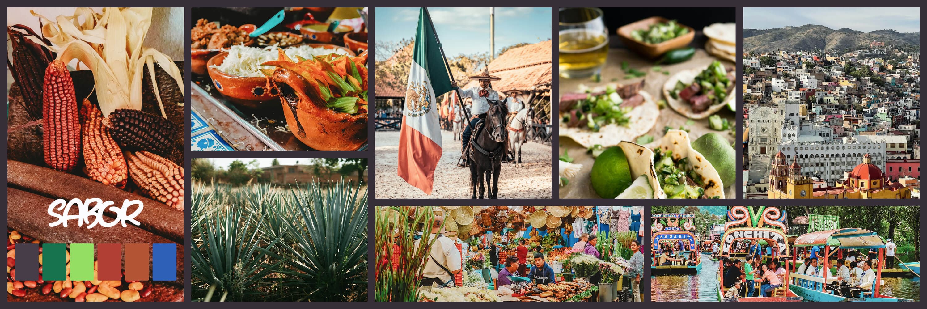
Next, I created a mood board to explore the visual direction. I pulled inspiration from traditional Mexican cuisine, art, and landscape photography—elements that conveyed energy and warmth. This mood board became the visual foundation for the design system's colors and shapes.
I also designed a custom logo that echoed the bold, handcrafted aesthetic. These early explorations helped guide the development of components and visual styles that were both functional and full of personality.
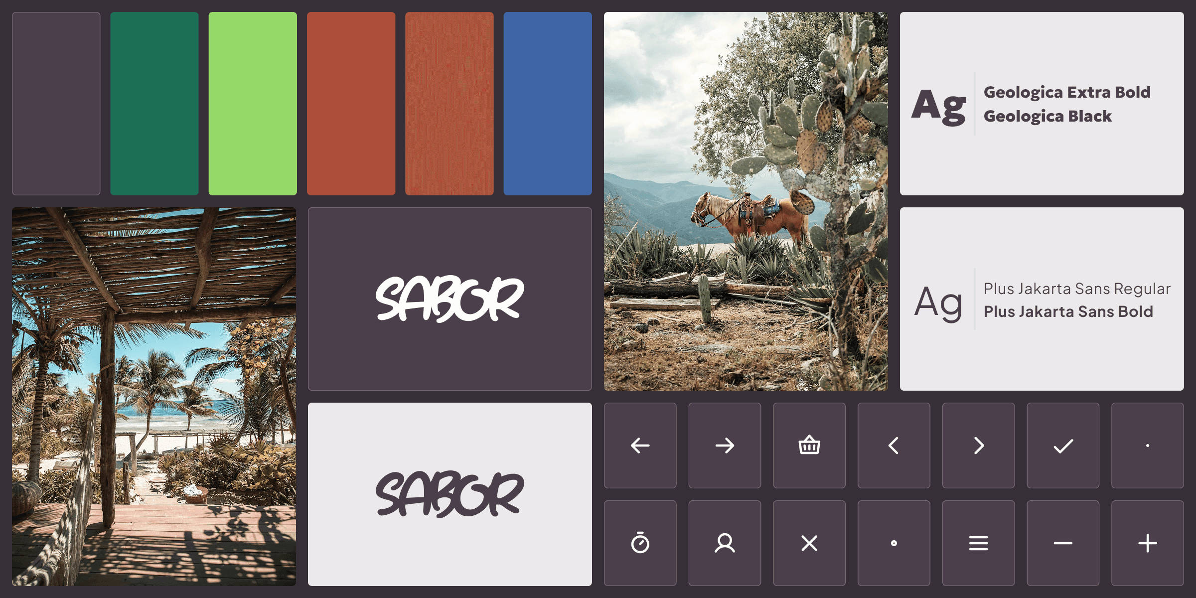
Sabor's visual identity draws from the rich world of Mexican cuisine and culture. The aim was to create designs that felt vibrant and flavourful, yet grounded and approachable. With rounded shapes, bold type, and a palette rooted in earthy browns and bright greens, Sabor design system brings approachability and energy, while maintaining clarity and consistency.
Sabor's foundations were designed to balance personality with usability. A warm cacao brown anchors the palette, complemented by vibrant lime and cilantro greens for a fresh, energetic feel. Rounded typefaces and simple icons bring approachability and clarity to every screen.
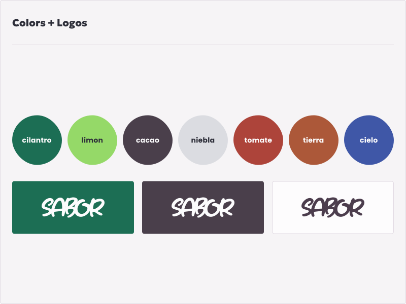
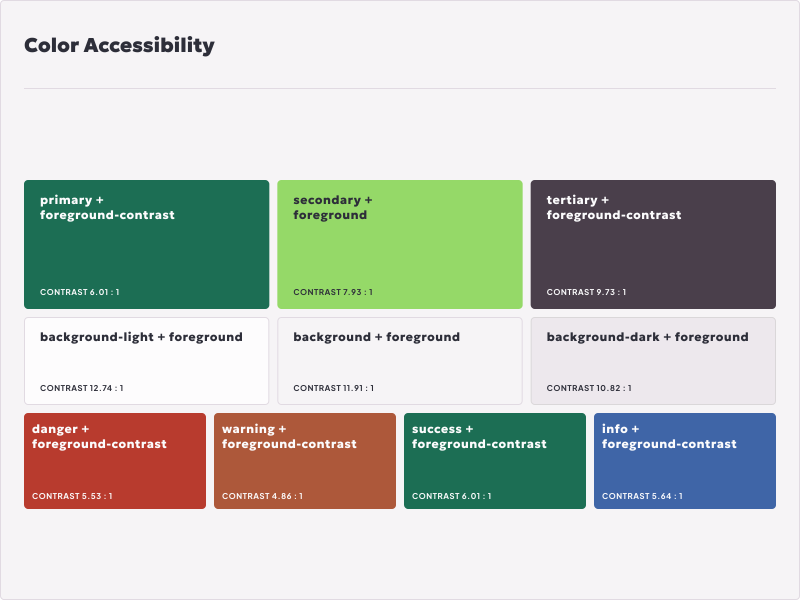
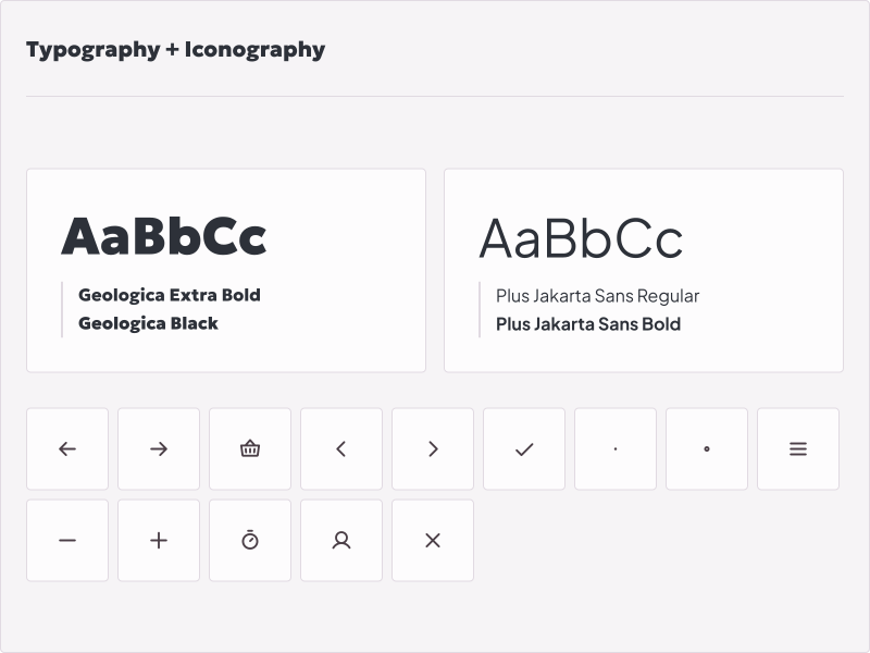
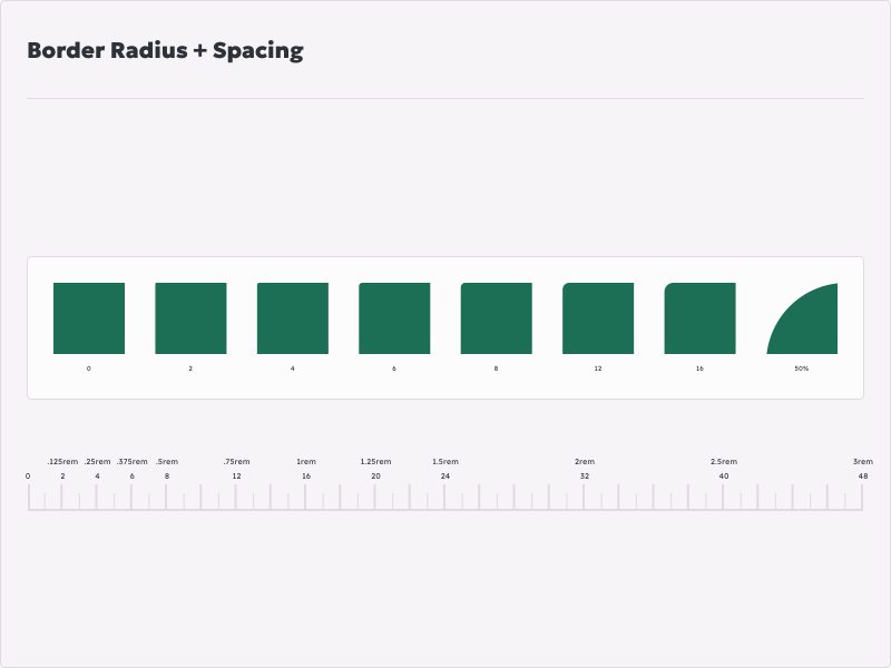
To ensure consistency and scalability across the product, I defined a set of design tokens that captured Sabor's visual identity. These tokens included color, typography, and spacing—each one rooted in the system's core principles of warmth, clarity, and flavour. By standardizing these foundational elements, I created a shared language that made it easier to build cohesive interfaces.
Sabor's components were designed for clarity, consistency, and ease of use. Each element—from buttons to navigation—was built to be reusable, accessible, and visually aligned with the system's overall style.
The Sabor Design System was built to bring consistency, clarity, and efficiency to the product development process. By establishing a shared set of styles, components, and design tokens, it streamlined collaboration between design and development, reduced redundancy, and made it easier to scale the interface as new features were added.
This consistency across screens not only accelerated development—it also created a more cohesive, intuitive experience for users, making everything feel connected and easy to navigate.
Whether you need help shaping a new SaaS product, refining an existing web or mobile experience, or building a scalable design system, I'd love to hear from you.