
Design system initially built for a B2B CRM platform and equally well suited to fintech and edtech products. Deep greens and calm neutrals inspire trust, clean typography keeps every screen clear and easy to read, and soft rounded corners make the interface feel friendly and approachable.
This case study presents a modified version of the original work to maintain client confidentiality.
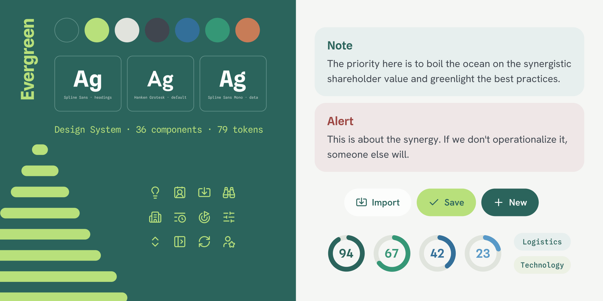
Evergreen was created to provide a calm, consistent visual language that easily adapts to a variety of data-driven products. The goal was a lean, purposeful system: a focused set of design tokens, typography, and components that covers each product's everyday needs and grows with it.
Soft sage neutrals set a calm foundation for every screen, while brand and status colours highlight actions and meaning.
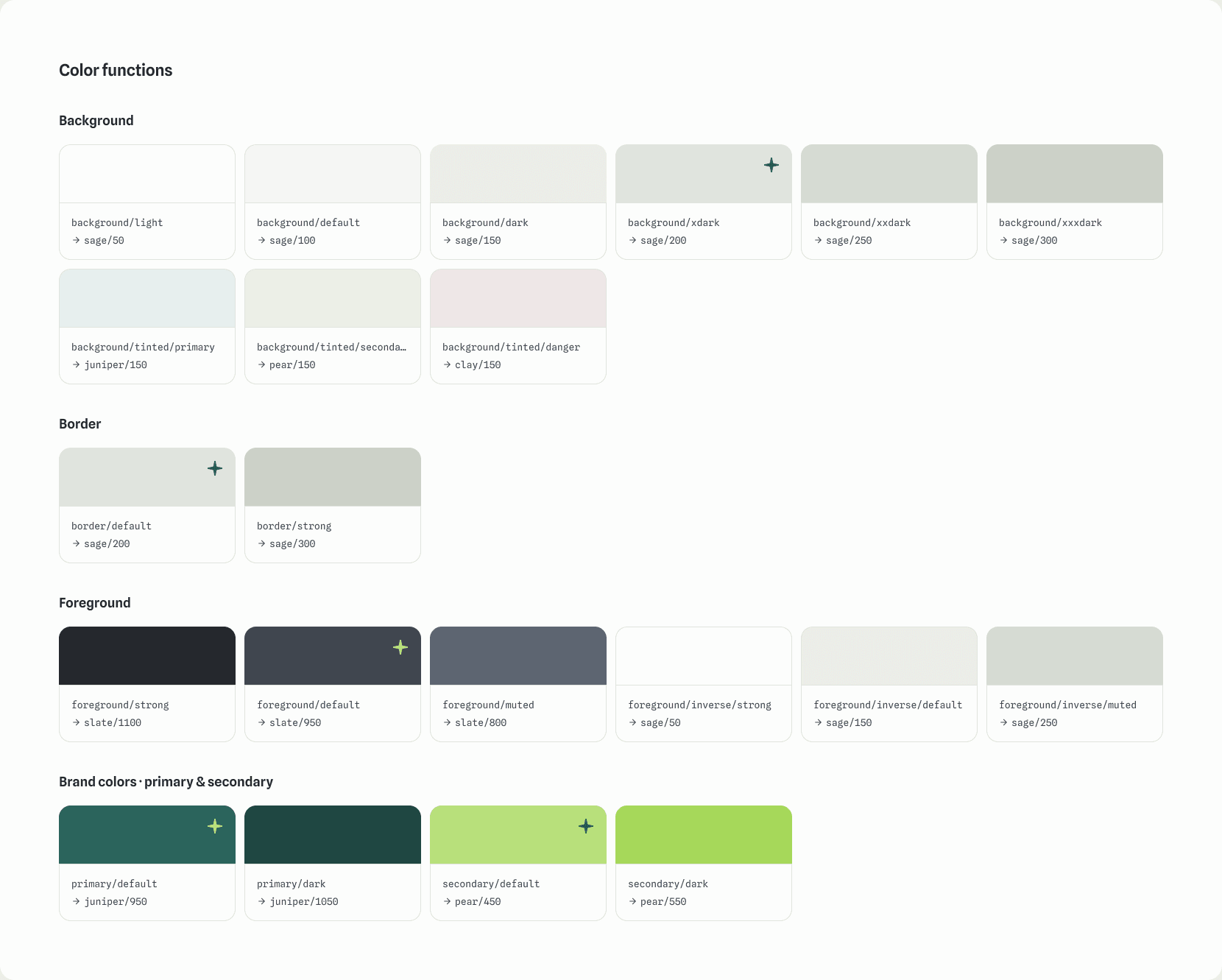
Semantic tokens like background/tinted/primary and foreground/muted describe how each colour is used, making the right choice clear for designers and developers alike.
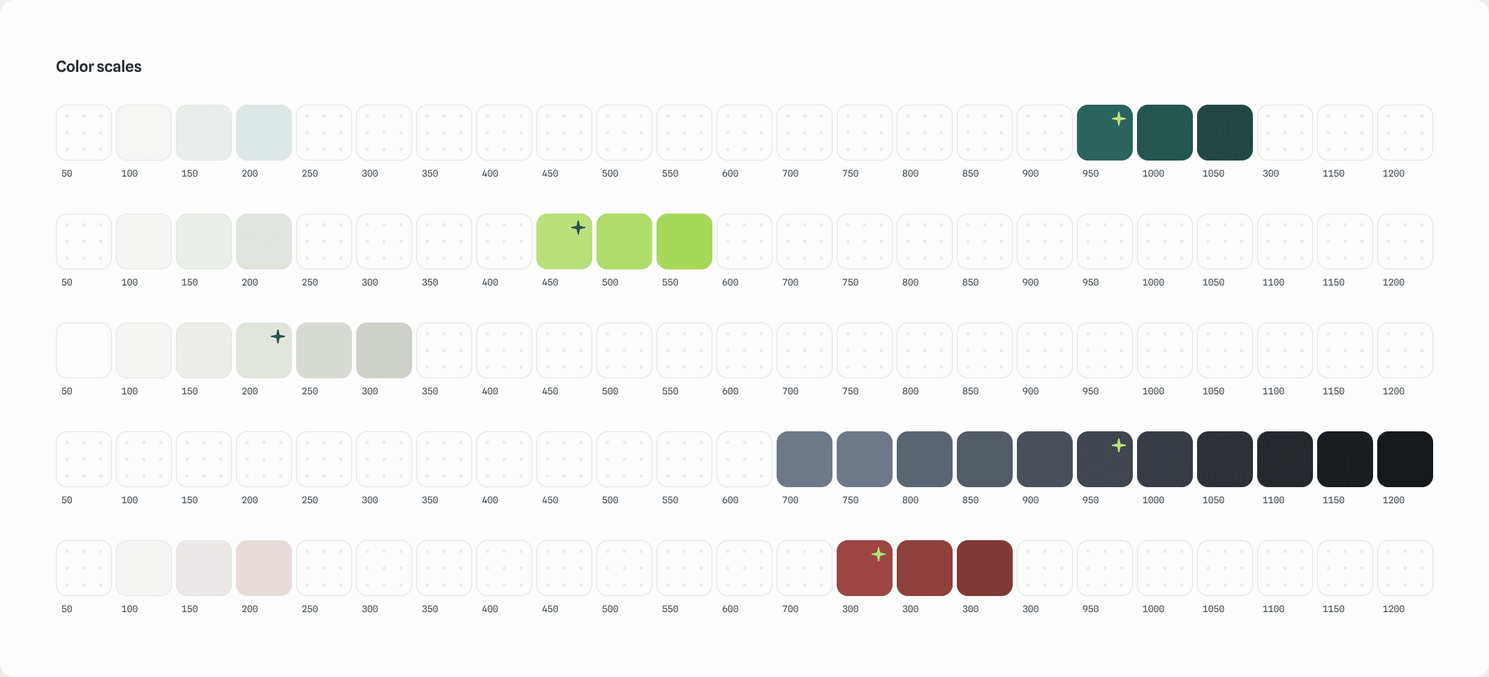
Each colour scale includes exactly the steps the product uses, keeping the system lean, easy to learn, and simple to maintain.
The palette brings together five main colours (Juniper, Pear, Sage, Slate, and Clay) and three auxiliary colours (Denim, Forest, and Sienna).
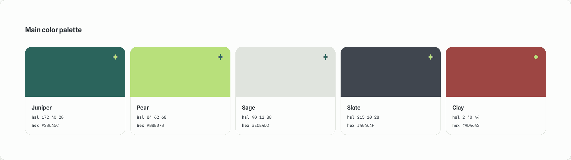
Every colour shares the same HSL lightness scale, from step 50 (99% lightness) to step 1200 (8%). This keeps contrast consistent from one hue to the next and makes new colours simple to add. For more on this approach, see my post on colour variations with CSS relative colours.
Colour functions give each colour a clear role: backgrounds from light to extra dark, tinted backgrounds for primary, secondary, and danger messages, two border strengths, foreground colours with inverse versions for dark surfaces, and brand colours with darker hover states. Every colour combination is checked for accessible contrast.
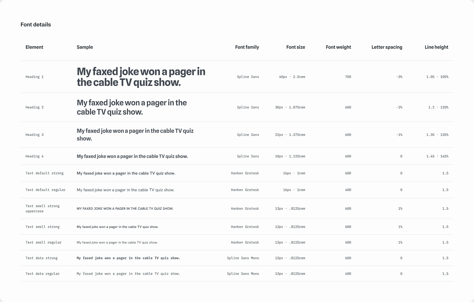
Three typefaces each have a clear role: Spline Sans for headings, Hanken Grotesk for text, and Spline Sans Mono for data such as labels, tags, and numbers. Eleven text styles cover every need, and headings get tighter letter spacing and line height as they grow, so large text stays compact and balanced. Every size is defined in pixels and rem for a smooth handoff to code.
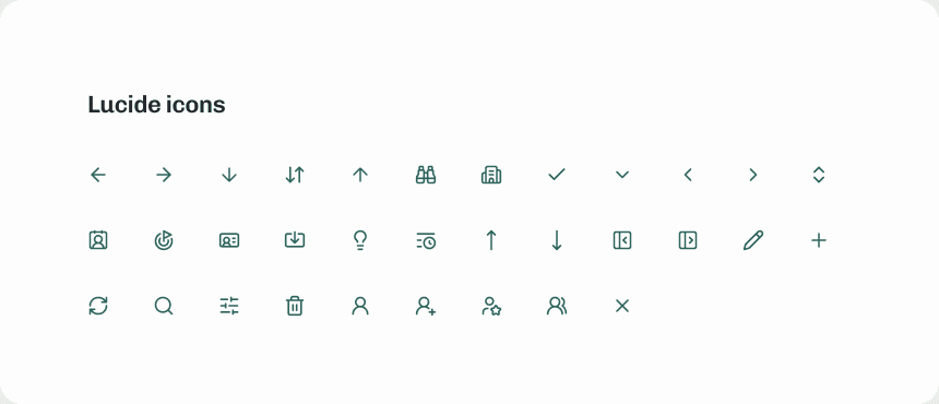
A curated set of Lucide icons at 20px covers the CRM's everyday actions, from contacts and companies to goals and activity.
36 components bring the foundations together. Each one is built from the same tokens, so the whole system stays consistent.
Evergreen continues to grow with the product. Next up are patterns for forms and tables, built from the same foundations and components.
Whether you need help shaping a new SaaS product, refining an existing web or mobile experience, or building a scalable design system, I'd love to hear from you.